Coffee Shop Loyalty Card Design: What to Include and What to Skip
Most loyalty cards fail before a customer even gets home. They're too crowded, too vague, or too easy to lose at the bottom of a bag — and a card nobody carries is a loyalty program that isn't working. This guide gives you a clear keep/skip checklist, a physical-vs-digital comparison, and a concrete action plan you can work through this afternoon.
TL;DR
- Every loyalty card needs exactly five things: your shop name and logo, the reward offer, stamp boxes, an expiry date, and a redemption instruction.
- Standard physical size is 3.5" × 2" in the US (88.9 × 50.8 mm) or 85 × 55 mm for EU/ISO 7810 — business-card size, because it fits in a wallet. 1
- Keep your smallest text at 6–8pt minimum — the professional print convention — because café lighting is dim and small print gets ignored.
- One simple reward beats a tiered system every time for an independent shop.
- A digital card in Apple Wallet or Google Wallet removes the "I left it at home" problem by design.
- Pull your branding from what you already use on your menu and signage — don't start from scratch.
- Skip printing your full terms and conditions. A short URL or QR code to a terms page is enough.
The Five Things Every Card Must Have
Nothing less. Here's what earns its space.
Your shop name and logo. Without it, the card could belong to anyone. Logo first, shop name readable at arm's length — that's the whole brief. If customers need to squint to confirm it's yours, redo it.
The reward, in plain language. "Free drink after 10 stamps" is good. "Earn points toward a complimentary beverage of your choice upon completion of the loyalty journey" is not. One sentence. Twelve words or fewer. Vague rewards breed distrust — customers wonder whether the free drink applies to the oat-milk latte or just the basic drip.
Stamp boxes. Visual, countable, clearly delineated. This is not the place for creativity. Ten clearly spaced boxes beats ten decorative coffee beans that bleed together.
An expiry date (or "valid until" year). This protects you. An undated card creates arguments at the counter when a customer shows up two years later with nine stamps from a promotion you discontinued. One line — "Valid until Dec 2026" — removes the dispute.
A redemption instruction. One line: "Show this card at the counter." Sounds obvious until you watch a new barista freeze because nobody told them how the card is supposed to work.
That's the whole mandatory list. Everything else is negotiable.
How Many Stamp Slots?
Six to eight stamps means a fast first redemption — great for high-frequency daily buyers who'll feel rewarded quickly. Ten is the most common, and for good reason: it feels like a fair exchange for a free drink without feeling out of reach. Twelve or more risks feeling unachievable unless your average ticket is high enough to justify it.
A practical rule: count how often your regulars visit per week, multiply by your target stamp count, and see how many weeks it takes to get there. Five weeks for a daily buyer is fine. Five weeks for someone who comes in twice a month is too long — they'll give up before they're halfway there.
One thing worth trying: pre-stamp one or two boxes the moment you hand the card over. The psychology is straightforward — a card that already shows progress is more motivating than an empty one. No academic citation needed; ask any barista who's handed out both.
What to Cut
Most over-designed loyalty cards have the same problems. Run through this list before you send anything to print.
Full terms and conditions. Nobody reads four-point legalese on a card the size of their hand. A short URL or a QR code to your T&Cs page gives you full legal coverage in one line of space.
Multiple reward tiers. "5 stamps: free cookie. 8 stamps: 20% off. 10 stamps: free drink. 15 stamps: secret menu item." Stop. Complexity is the enemy of carry-through for an indie shop. Pick one reward and make it good.
Tiny text. Below 6pt, you're not communicating — you're just filling space. Print professionals consistently recommend staying within the 6–8pt range as a minimum for small-format print. Test it: print a proof and read it in the dim corner of your own café. If you struggle, your customers will too.
Busy backgrounds behind the stamp boxes. The stamp boxes are the functional core of the card. If a dark wood texture or a floral pattern makes it hard to see the stamps, the background goes.
Social media handles with no offer attached. Your Instagram handle on a loyalty card is dead weight unless there's a reason to follow — like "Show us your cup for a bonus stamp." Otherwise, cut it.
Staff name fields. Adding "Stamped by _____" sounds personal. In practice, it adds print complexity, runs out of space after two initials, and contributes nothing to whether the customer comes back.
Physical Card vs. Digital Card
Both work. They're not solving the same problem.
| Factor | Physical card | Digital card |
|---|---|---|
| Design effort | High — template, print file, bleed, CMYK | Low — upload logo, write reward copy, done |
| Printing cost | Ongoing ($0.05–$0.20 per card typical) | $0 |
| Lost-card risk | High — bags, pockets, washing machines | None — lives on the phone |
| Personalisation | Static — same for every customer | Dynamic — name, stamp count, push notifications |
| Apple/Google Wallet | Not applicable | Native |
Physical cards have their own constraints beyond design: lamination affects whether stamp ink adheres cleanly, CMYK colour rendering can shift your brand palette, and you need to reorder stock regularly. None of that is insurmountable — just budget for it.
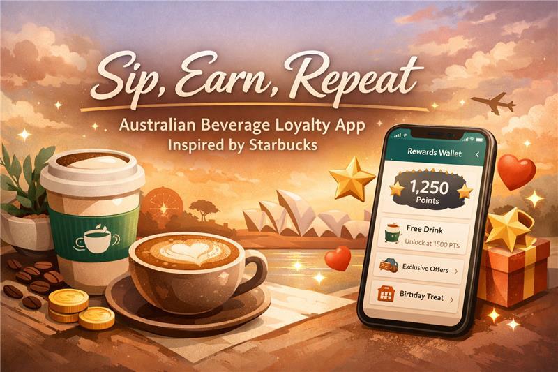
A digital loyalty card sidesteps those logistics. The card lives in Apple Wallet or Google Wallet; customers stamp via a QR code scan at the counter; there's no print file to prepare and no card to lose. The trade-off is that customers need a smartphone — which, for most café regulars, is not a meaningful barrier.
The honest take: if you're opening your first location and want to get something running this week, digital is faster to launch and easier to manage. If your customer base skews older or you already have physical cards in circulation, a hybrid approach works — run the physical card for existing customers, digital for new ones.

Making It Look Like Your Shop
You don't need a designer. You need to copy yourself.
Pull two or three colours from what you already use — your signage, your menu board, your packaging, your apron. Those colours are already your brand. Introducing new ones on a loyalty card creates a disconnect that feels off even if customers can't articulate why.
Use the logo file you already have. If it lives on your website or your menu PDF, extract it. Vector is ideal; a high-resolution PNG is fine. Avoid stretching or recolouring it.
For fonts: match whatever you use on your menu headers if you can. If you don't have a consistent font yet, one clean sans-serif for body copy and one display font for your shop name is the maximum. Two fonts. Not five.
Coffee-specific visual cues — a cup icon, a bean motif, a warm cream-and-brown palette — work well as accents. Sparingly. A card that's half clip art feels like a template. White space is not wasted space; a card with breathing room looks more premium than a packed one.
Canva has usable loyalty card templates. Open one, swap in your logo and colours, rewrite the copy, resist every urge to add anything else. That's usually enough.
Your Action Plan
- Write your reward offer in one sentence — 12 words maximum. (Example: "Enjoy a free drink after collecting 10 stamps.")
- Decide your stamp count using the frequency rule: visits per week × stamps = weeks to reward. Keep it under six weeks for daily buyers.
- Grab your logo file and pick two brand colours from your existing materials.
- Open a Canva template or your print supplier's template. Drop in your shop name, reward, stamp boxes, and expiry year. Add the redemption instruction. Stop there.
- Print one test copy. Take it to the darkest corner of your café and read every element. Fix anything you have to squint at.
- Going digital? Skip steps 4 and 5. Upload your logo and reward copy to your loyalty platform — the card is generated automatically.
Skip the Design Headache Entirely
If the print-file route feels like more than you want to deal with right now, BaristaCard generates a digital loyalty card from your logo and reward copy — no design tools, no print order, no lost cards. Customers collect stamps via a QR code scan at your counter and carry the card in Apple Wallet or Google Wallet. Setup takes minutes, not days.
It's one less thing to manage so you can stay focused on the coffee. Learn more about how a full loyalty program fits together if you're still working out the structure before the design.

Sources
- Vistaprint. "Business Card Dimensions." Vistaprint Design Hub. Retrieved 2026-05-23. "Actual Size: 3.5″ x 2″ … Trim: 88.9 x 50.8 mm / 3.50 x 2.00 in." https://www.vistaprint.com/hub/business-card-dimensions — The 85 × 55 mm figure is the EU/ISO 7810 ID-1 standard (CR80), widely used outside North America. ↩
Redo att öka lojaliteten hos ditt café?
BaristaCard hjälper kaféer att förvandla engångsbesökare till stammisar med digitala stämpelkort, belöningar och insikter i realtid. Gratis att komma igång.
Kommentarer (0)
Logga in att lämna en kommentar.